How Good Design Enhances Document Security
Well-Designed Identity Documents Are Both Secure and Meaningful
The past few decades have brought enormous attention to the design of everyday objects, from toasters to door handles.
Identity documents are just as vital to everyday life, and they, too, require good design. This isn’t just a matter of politics or national vanity. Identity document design matters because it helps countries strengthen security, facilitate simpler verification and connect more meaningfully with their citizens and residents. Here’s why.
The Importance of Good Design
Identity documents are made to serve a very specific purpose: to verify that people are who they say they are. Their design could be purely functional, containing just enough elements to enable secure authentication and making no attempt to incorporate anything that evokes meaning or inspires further thought. In this section, we’ll discuss why that’s not a good idea.
An identity document represents an opportunity to connect with your residents. This opportunity often comes just once every 10 years, and it gives countries a chance to engage people in a discussion of identity and citizenship. Designs should be forward-looking; they should reflect a country’s culture and its aspirations. How many of the handful of new designs that are launched each year truly impress or inspire? How many make document holders want to give them more than a cursory glance? Each one that doesn’t represents a lost opportunity for civic engagement.
Good design strengthens document security. A passport or ID card is an enabler, whether it’s used for traveling to a different country, entering a building or making an age-restricted purchase. Its design must therefore facilitate the authentication process. Though dedicated devices can validate IDs with a swipe or a scan, most verification still relies on simple visual inspection. That makes document design a critical security feature, because familiarity with a document is its first line of defense. Good design — meaning clear and uncluttered — is easier for examiners to “read” and therefore to authenticate, because it’s easier for them to see when something is not quite right.
Good design also makes documents harder to counterfeit. When security features have been thoughtfully integrated into a document’s visual design, that design is substantially harder to disassemble and recreate.
Principles of Good Design
International standards — like the International Civil Aviation Organization’s ICAO 9303 — already specify many elements of a travel document’s design, from its size and format to specific security features that must be included. Design content is one of the few areas where no instruction or guidance are provided. For designers, this is often as freeing as it is challenging. A few best practices have emerged, however.
Keeping a document’s design relevant and secure for long periods of time — as long as ten years, in the case of passports — is a challenge that few other design sectors face. It forces designers to be more thoughtful in their choices and more considered when evaluating the elements that might enhance the document’s meaning. These elements include:
- Culture – The culture and ambitions of a country presented in a way that’s non-stereotypical or derivative
- History – Important moments that reflect contemporary relevance
- Landscape – Iconic flora and fauna ground designs in the natural world
- Landmarks – Attractions that aren’t just recognized by tourists but cherished by residents
These elements must then be woven into the technical features that protect the document to unite design and security.
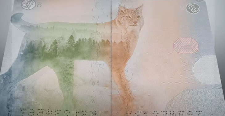
The pages of the Estonian passport, for example, feature several different animals that are found in the country’s cherished national forests. On each of those pages are tiny graphical elements called screens — essentially, smaller versions of the animal that’s featured in the main image — that are invisible to the naked eye but difficult for forgers to reproduce.

Other details are hidden in the UV print, including an image of the moon that cycles through the pages, as it does in the northern hemisphere.

Together, these choices reinforce the security and meaning of the broader document.
The ID Design Process
How, then, do security document designers extract the information they need to create meaningful documents?
At HID, our team starts with curated workshops that help designers understand the perspective and experience of a country’s residents. The goal is to engage nations in a discussion of which symbols, patterns, icons, colors and geographies are most important to them — and start to form a narrative that can be woven into the final design.
We supplement these workshops with further in-country travel to get a better sense of local points of view. Then, we collaborate with government officials to discuss, refine and implement the ideas that have surfaced. A good design should not represent an outsider’s view of the country. It should paint a deeply personal picture that resonates with residents and drives a long-term relationship with those who use it every day.
It should serve, in other words, as a window onto the world — and a reminder of what home is about.
Designing an ID that captures your country’s essence can feel daunting. Read our white paper, Succeeding With Identity Document Design, and find out how to set your project up for success >>
Matt Sugdon, PhD, is the Director of Security Graphics at HID Global and leads the creative team producing security designs for passports, ID cards and other government issued credentials. Matt has worked in the security printing industry for over 20 years in a variety of technical and new product development roles.
